Build modern web applications withFlowbite Qwik
Flowbite Qwik is an official Flowbite component library for Qwik. All interactivities are handled by Qwik.

Qwik UI Components
Explore the entire collection of over 41 open-source UI components and interactive elements built with Qwik, Flowbite and Tailwind CSS


Qwik UI components
Flowbite Qwik is a free and open-source UI component library based on accessible Qwik components and Tailwind CSS.
Get started building modern web applications using the Qwik UI components from Flowbite based on Tailwind CSS and the Flowbite design system by installing the package via NPM.
Browse a collection of hundreds of interactive UI components such as dropdowns, navbars, modals, and more.
- Huge collection of UI components built with Qwik
- Open-source under the MIT License
- Compatible with QwikJS 1.5
- Utility classes based on Tailwind CSS
- Based on the Flowbite ecosystem and design
- Fully accessible UI components

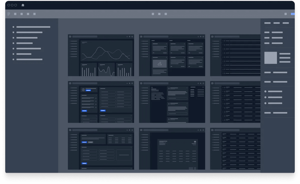
Dark mode integration
Flowbite Qwik has native built-in support for dark mode by using Tailwind CSS and the Flowbite design system.
All of the UI components from Flowbite Qwik will automatically invert the colors when activating dark mode via browser settings or using a custom switcher component.
- Increased accessibility based on room brightness
- Better visibility for users with low vision
- Improved readability for users with light sensitivity
- High quality UI/UX design for modern applications

Works with Tailwind CSS
Flowbite Qwik uses the Tailwind CSS utility classes under the hood which means it will be easy to customize the appearance and specifications of the UI components directly from the HTML code.
Tailwind CSS is a popular and open-source utility-first CSS framework that you can use to speed up the development of your front-end projects.
Flowbite Qwik is also based on the core Flowbite UI component library the also features interactive UI components like dropdowns, modals, navbars, and more.
Flowbite provides a robust set of design tokens and components based on the popular Tailwind CSS framework. From the most used UI components like forms and navigation bars to the whole app screens designed both for desktop and mobile, this UI kit provides a solid foundation for any project.
Designing with Figma components that can be easily translated to the utility classes of Tailwind CSS is a huge timesaver!
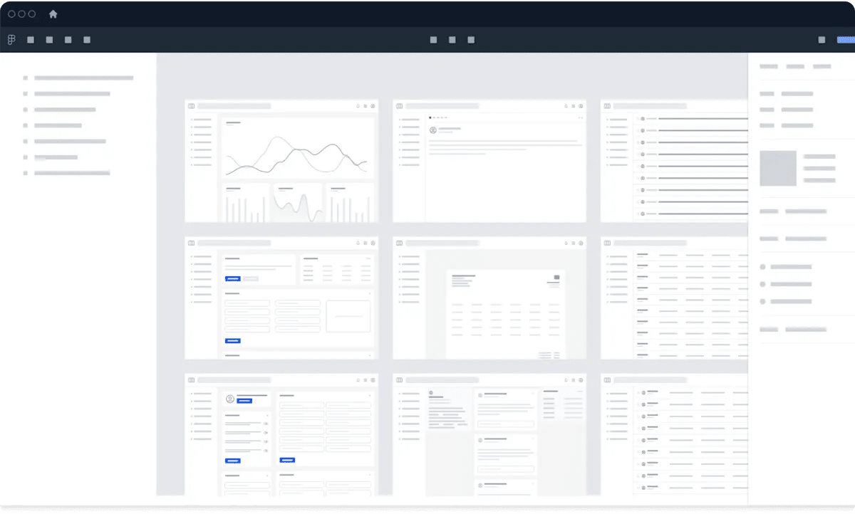
Design with Figma
Get started with the most popular and definitive design system built in Figma and used by thousands of designers and agencies that is compatible across multiple frameworks in the Flowbite ecosystem including React, Vue, Svelte, and Qwik.
Check out the following resources to learn more about Flowbite Figma:
Community contributors
Join a community of open-source contributors by tuning in with the Flowbite Qwik community and become one of the highlighted members


Join the community
Become a member of a community of developers by supporting Flowbite